What our partners say about us
You are likely to be 100% satisfied with the work, with a score of 5.0 being our average.
Together with the Che IT Group team, we organized a technical meetup dedicated to mobile development standards. The main topic of discussion was the “Mobile Development Guide” — a set of rules and approaches that help developers make the right interface decisions when a designer hasn’t provided separate mockups for mobile devices.
In the modern web, situations where only a desktop version exists but deadlines require immediate adaptation happen quite often. In such cases, the developer effectively becomes a co-author of the product, taking on some of the functions of a UX&UI designer. We have gathered the key takeaways from our presentation so you can use them as a roadmap for your projects.
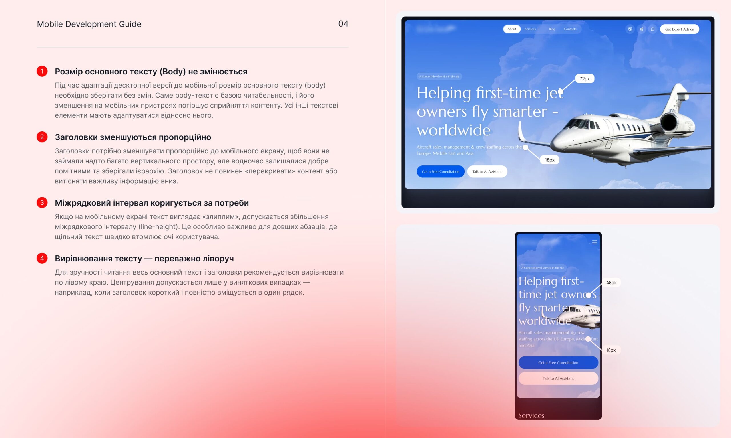
Typography is the foundation of any mobile interface. The biggest mistake during adaptation is proportionally shrinking all text elements. We recommend following this rule: the main text (Body) should remain unchanged, typically in the 16–18px range. This is critical for readability without requiring users to pinch-to-zoom.
In contrast, headings should adapt dynamically. On a mobile screen, they should be noticeable but should not occupy more than 30–40% of the first screen to avoid pushing useful content down. Particular attention should be paid to line-height: while it can be tight on desktop, it should be slightly increased on a smartphone to avoid the “clumping” of lines in long paragraphs.
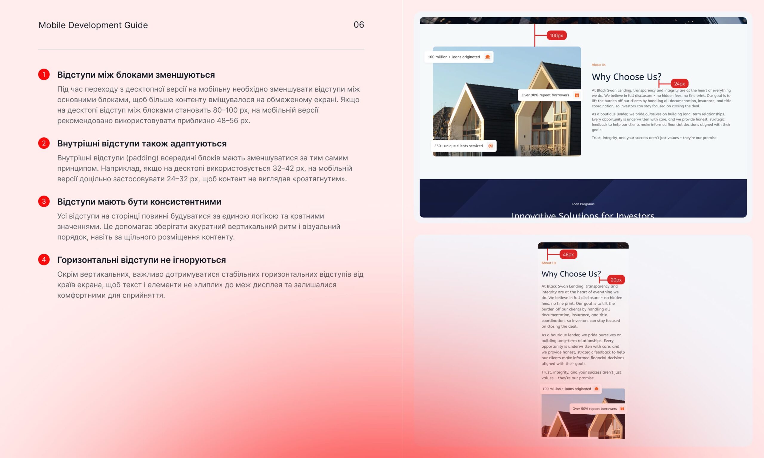
Spacings are what make a design look “premium” and organized. When transitioning to smartphones, external spacings between large logical blocks (margins) should be reduced by about half compared to desktop (for example, from 100px to 48–56px). This maintains scroll dynamics and fits more content into a limited area.
Internal spacings (paddings) must be consistent. We advise using a multiple-based system (e.g., 4px or 8px steps), which helps build a clear vertical rhythm. We specifically emphasize the importance of side margins: they should be at least 16–20px so that content doesn’t “stick” to the edges of the display, which can be visually uncomfortable.
When dealing with complex blocks, a developer must analyze content priority. In Hero sections (the first screen), it is often appropriate to crop secondary decorative elements of an image or hide them entirely, focusing the user’s attention on the headline and the call to action (CTA). This increases conversion because the user immediately sees the core offer.
For cards and info blocks, we use two main scenarios: a vertical stack (blocks placed one under another) or a horizontal slider (Slider/Carousel). The second option is ideal for e-commerce or portfolios, as it saves screen real estate while providing access to all elements via the familiar “swipe” gesture.
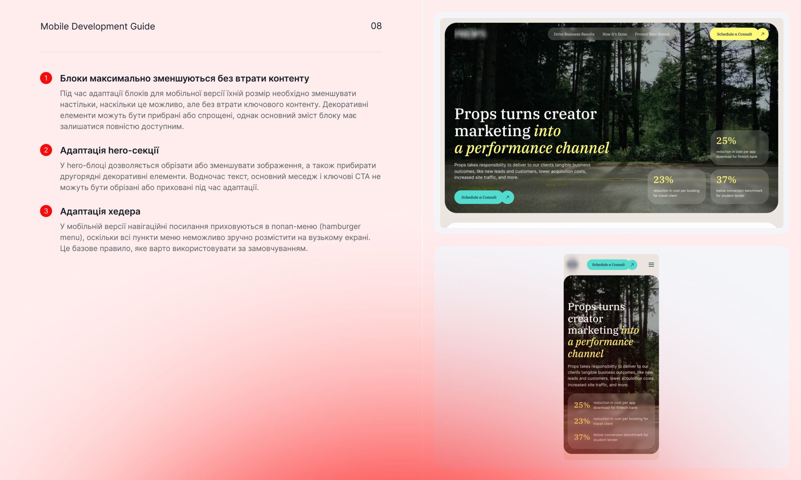
Mobile devices lack a hover state, so all interface solutions based on this state (e.g., dropdown menus or tooltips) must be reimagined. They should open on click or be immediately visible in an active state. This also applies to the footer: instead of long lists of links, it’s better to use accordions that a user can expand as needed.
Interactive elements like buttons and inputs should remain functionally consistent but adapted for touch interaction. The tap target size should be comfortable for a finger (min. 44px), and the elements themselves should not lose their clarity even after scaling.
A high-quality mobile version is not just a copy of the desktop; it’s an adapted user experience. When a developer understands these basic principles, the product feels cohesive even without 100% mockup coverage in Figma.
If you are facing difficulties with adapting complex projects or want to strengthen your business with a professional UI/UX solution, the Revend Group team is always ready to help. We specialize in creating high-performance websites and strategic design tailored to your results.
Have questions or a complex project on the horizon? Get in touch with us — we’ll discuss your goals and find the best technical solution for your business.