What our partners say about us
You are likely to be 100% satisfied with the work, with a score of 5.0 being our average.
Recently, a presentation was held on the use of variables and design tokens in Figma. In this article, we share the key insights and practical knowledge gained by the participants during the event.
In the world of design and technology, we are surrounded by new tools that revolutionize our perception of aesthetics and functionality. Among these innovations is the use of tokens, which open up new possibilities for better control and adaptability in design.
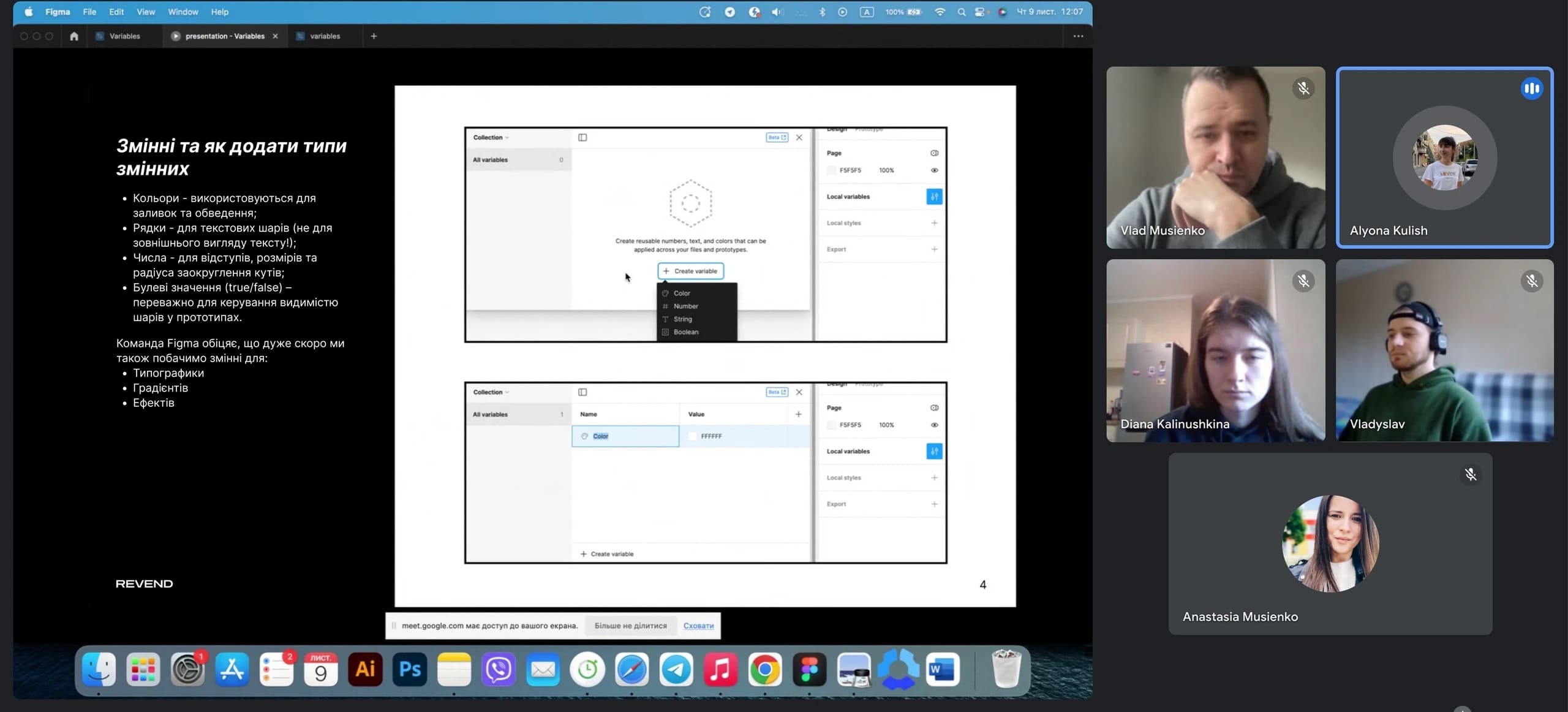
Tokens (variables) are not just styles; they are reusable definitions aimed at various design attributes such as colors, numbers, and strings. Your design can now be more flexible and adaptive, not only through the ability to create color styles but also for details like module corner radii, heights and widths, internal paddings, and text inside buttons.
The difference from ordinary styles is that tokens can change their definition depending on the selected theme. This opens new creative horizons for designers, allowing the creation of unique and engaging design elements for any context.
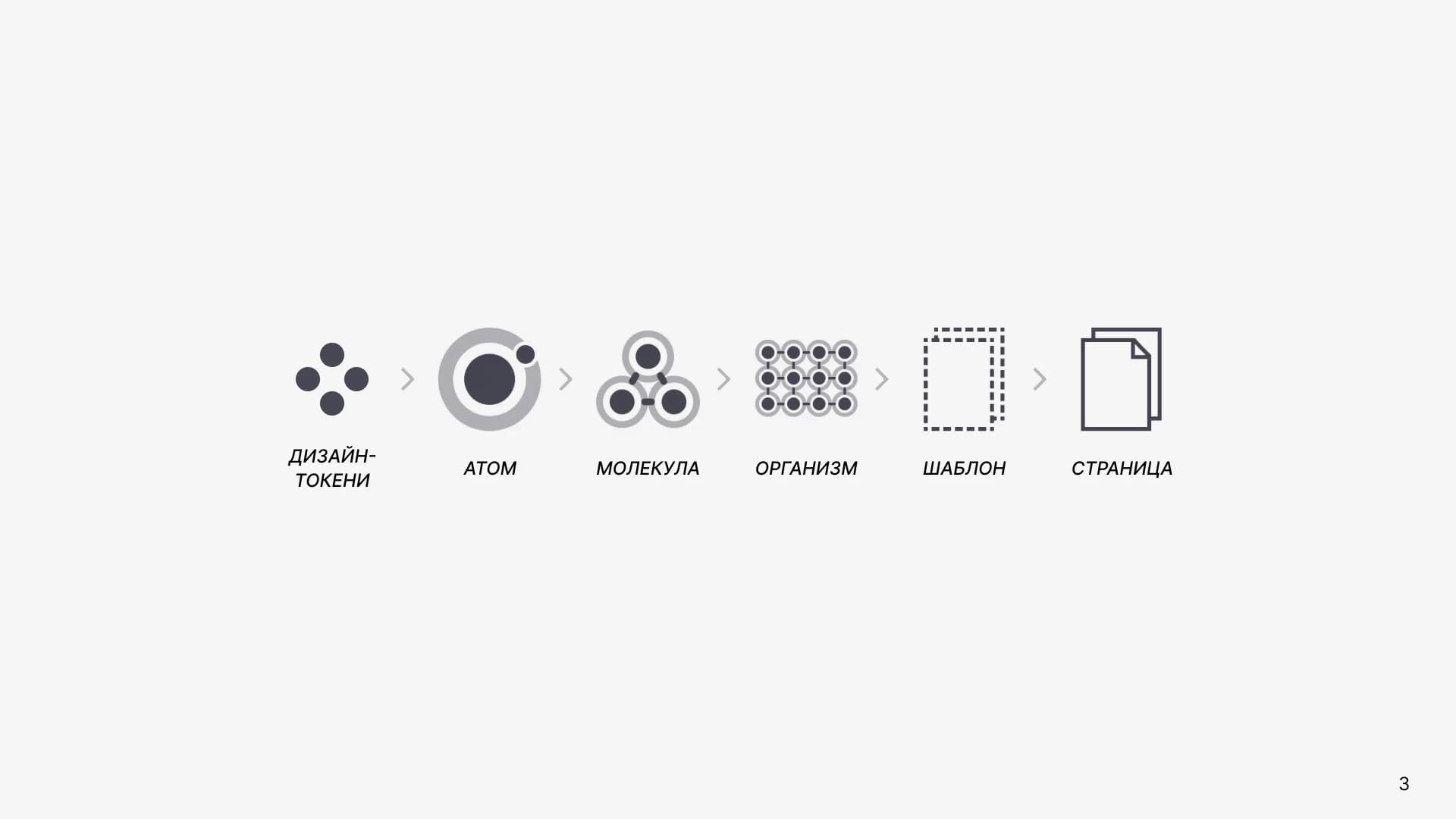
In design, there is something atomic, moving from smaller to larger elements. That is, our design consists of atoms — small building blocks such as colors, buttons, and other elements.
The UX/UI designer from Revend Group also emphasizes that these atoms are the core building blocks that form the entire design and contain information that can be used independently of the platform. An atom can have a border, gradient fill, font, font size, whereas a design token does not. This is the simplest unit of a design system, and variables work with tokens, not atoms — meaning they work with fill color, border color, etc.
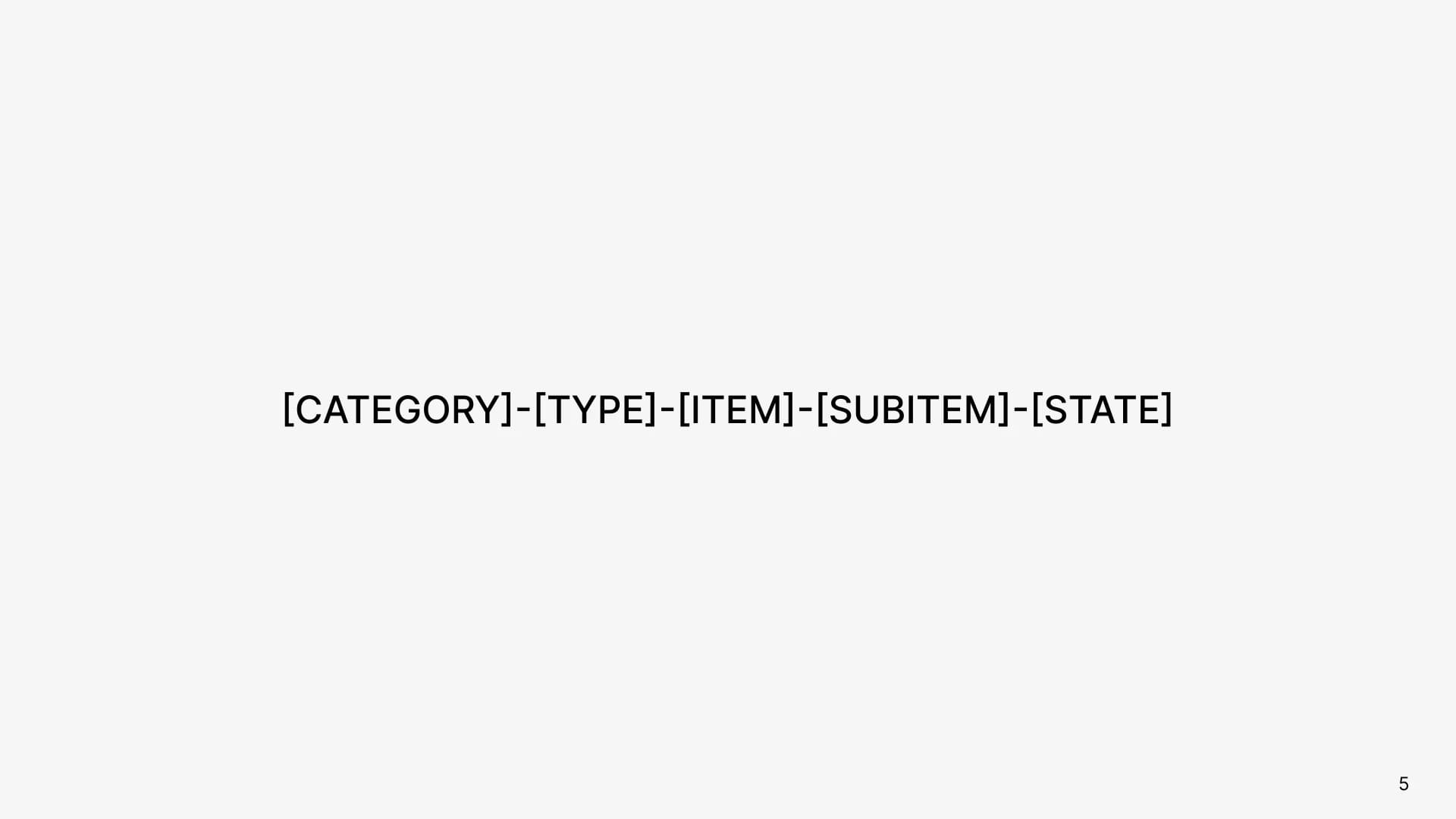
A token should contain five values:
The structure depends on the specific element and may vary.
Using these five values allows you to systematize and easily identify design tokens across your project.
Token names are not just a string of characters; they are a system that helps you and your team organize and understand your design. By applying this approach, you create consistent and easily manageable design systems, which is key to successful work and collaboration in design.
Figma has styles. They are suitable for small projects and beginner designers, while tokens are intended for experienced designers and large projects. However, it is not as simple as it seems. Styles are still needed by professional designers for big projects because there is one major difference: you cannot add a gradient to tokens (variables). Styles preserve not only single values (like a color or a number). Therefore, when it comes to shadows or gradients, styles are still used.
Variables are the smallest unit in our design system. Styles are a bit larger. Therefore, design variables are developed first, and then additional styles may be added. Variables can reference other variables, making them more flexible. Styles cannot do this.
At Revend Group, the UX/UI team uses either styles or variables in their projects, and depending on project complexity or client request, decides which to choose. While both approaches can produce similar results, variables prove to be a more advanced feature. Thus, if you are working on a design system or frequently creating prototypes, variables may be your best choice.
In practice, design tokens open up numerous possibilities:
These practical applications make variables a key tool for fast and efficient design. They allow you to easily adapt your projects to different conditions and requirements, ensuring a high level of flexibility and productivity when working in Figma.
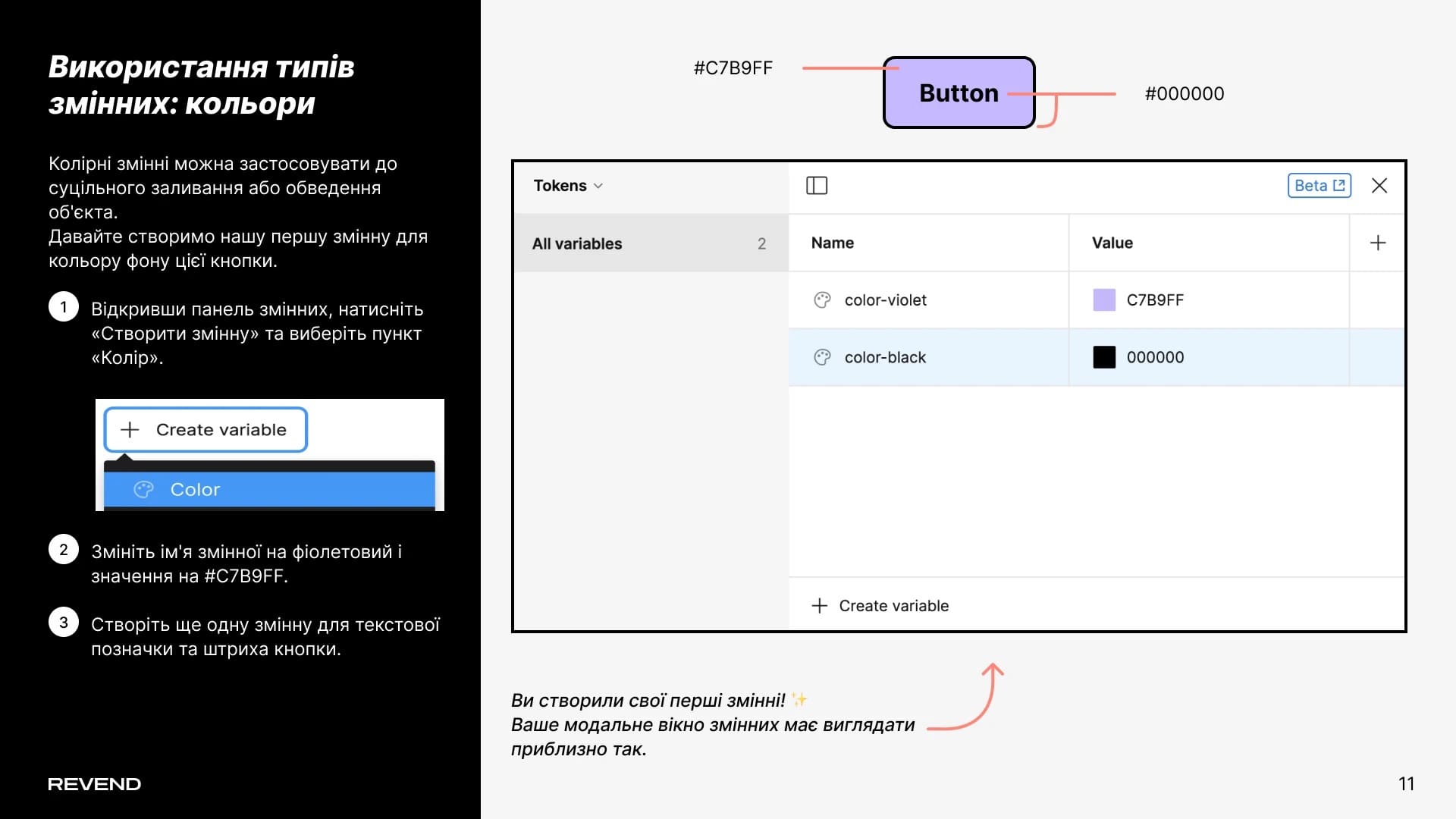
During the presentation, the UX/UI team shared their experience and experimented with creating the first variable for a button background color. Color variables can be used effectively to adjust the fill or border of an object in the design.
Let’s create our first variable for the background color of this button.
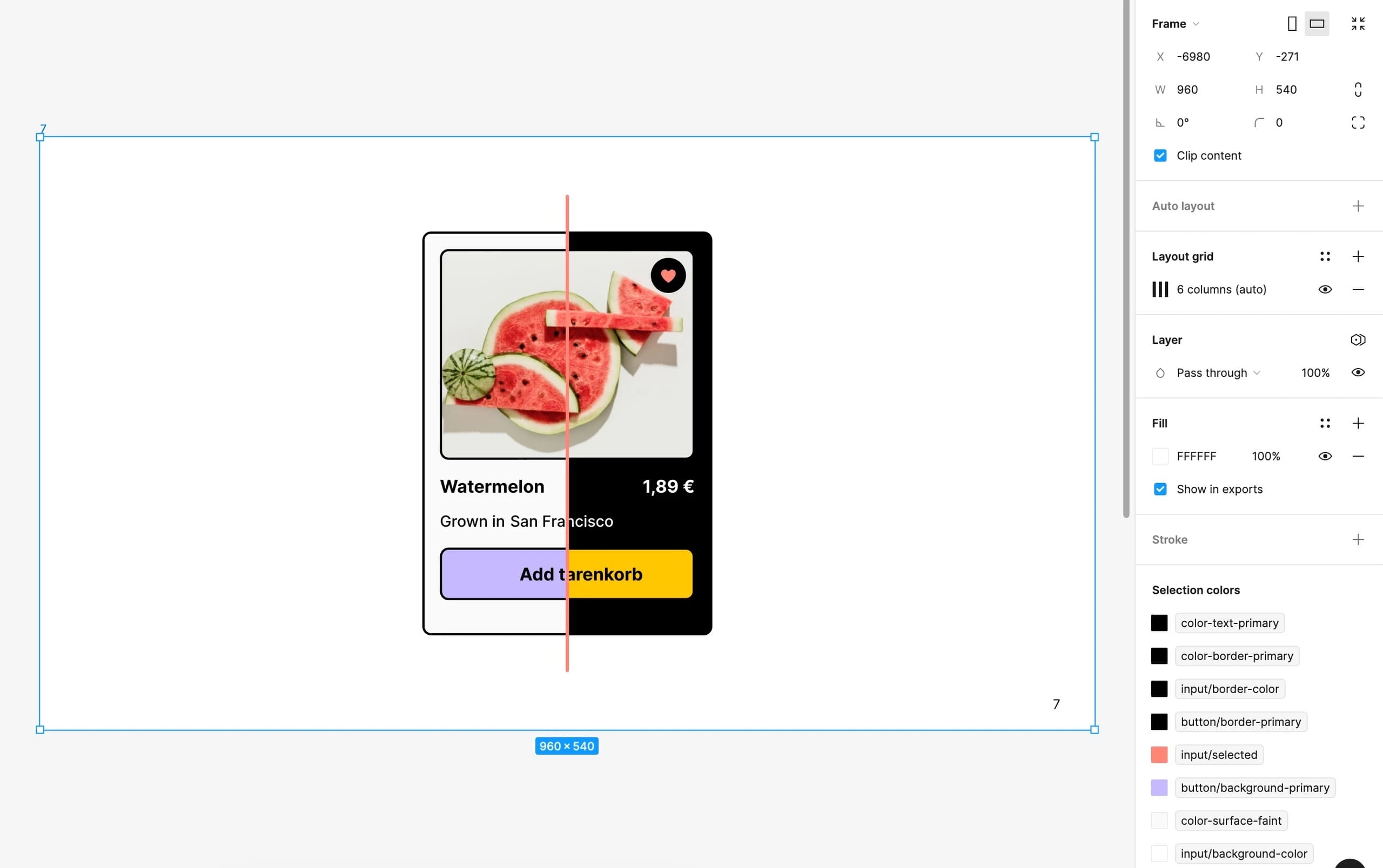
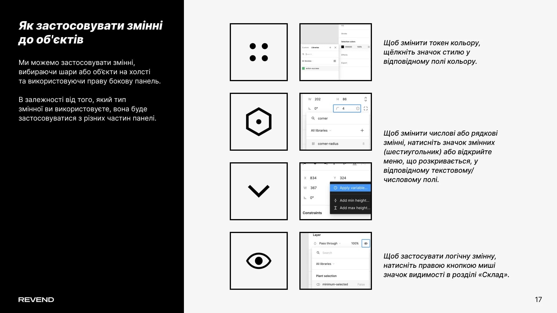
Variables can be applied by selecting layers or objects on the canvas and using the right-hand panel. Depending on the type of variable you use, it will apply from different sections of the panel.
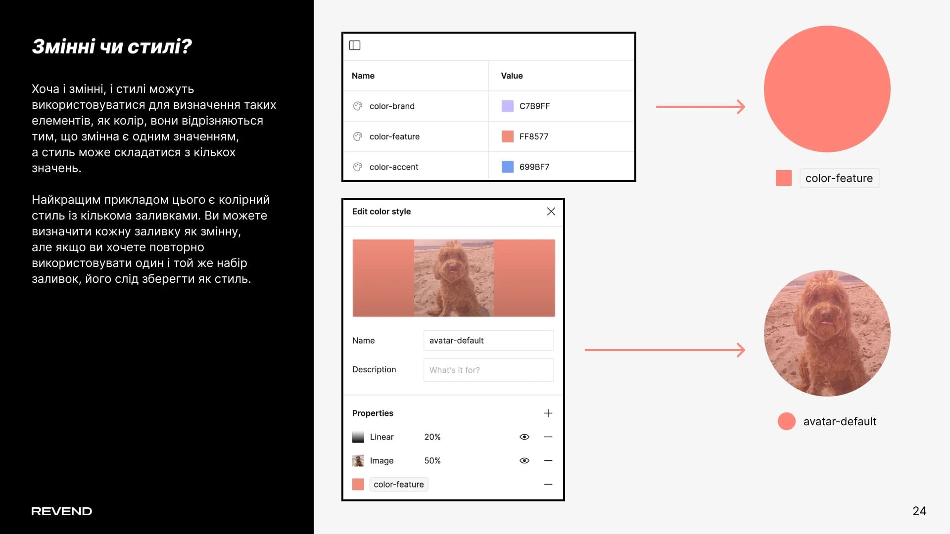
Although both variables and styles can define elements like color, they differ in that a variable is a single value, while a style can consist of multiple values.
The best example is a color style with multiple fills. You can define each fill as a variable, but if you want to reuse the same set of fills, it should be saved as a style.
We hope this presentation has sparked your interest and helped you better understand the importance of design tokens in the creative process.
If you have further questions or need a consultation, feel free to contact us.
We aim to be not only a source of information but also your reliable partner in the world of design and technology. Our team is ready to help you implement your ideas, grow your projects, and achieve great success together.
Thank you for your attention, and see you next time!