
Business Group Logistics — редизайн UX/UI для национального оператора 3PL
UX/UI редизайн логистической компании Business Group Logistics был выполнен с целью улучшить пользовательский опыт, навигацию и визуальную подачу услуг 3PL-оператора.
Business Group Logistics — ведущий 3PL-оператор в Украине с 30-летним опытом, предоставляющий полный спектр услуг: от международных грузоперевозок до фулфилмента и таможенного оформления.
Проект редизайна UX/UI, реализованный в синергии между маркетологами (WHY NOT GROUP), дизайнерами (Revend Group) и разработчиками (FamilyLab), был направлен на создание современной технологической платформы. Обновленный сайт стал визуальным подтверждением масштабов компании, упростил коммуникацию с клиентами и подчеркнул экспертизу бренда в сельскохозяйственном секторе, FMCG и электронной коммерции.

Ключевые особенности Business Group Logistics:
- География: национальное и международное покрытие.
- Гибкость: адаптация под отрасль клиента.
- Технологические возможности: интеграция с ERP, телематика, автоматизация складов.
- Сильная экспертиза: 30 лет на рынке, устойчивые партнёрства.
Редизайн сайта стал необходимым шагом, чтобы донести эти преимущества до широкой аудитории в удобном, понятном и современном формате.
Исходные задачи проекта
- Сделать сайт центральной точкой коммуникации с клиентами, где легко найти нужную услугу.
- Показать все направления деятельности (FMCG, агросектор, промышленность, e-commerce, международная логистика).
- Обновить визуальный стиль в соответствии с позиционированием компании как надёжного и инновационного партнёра.
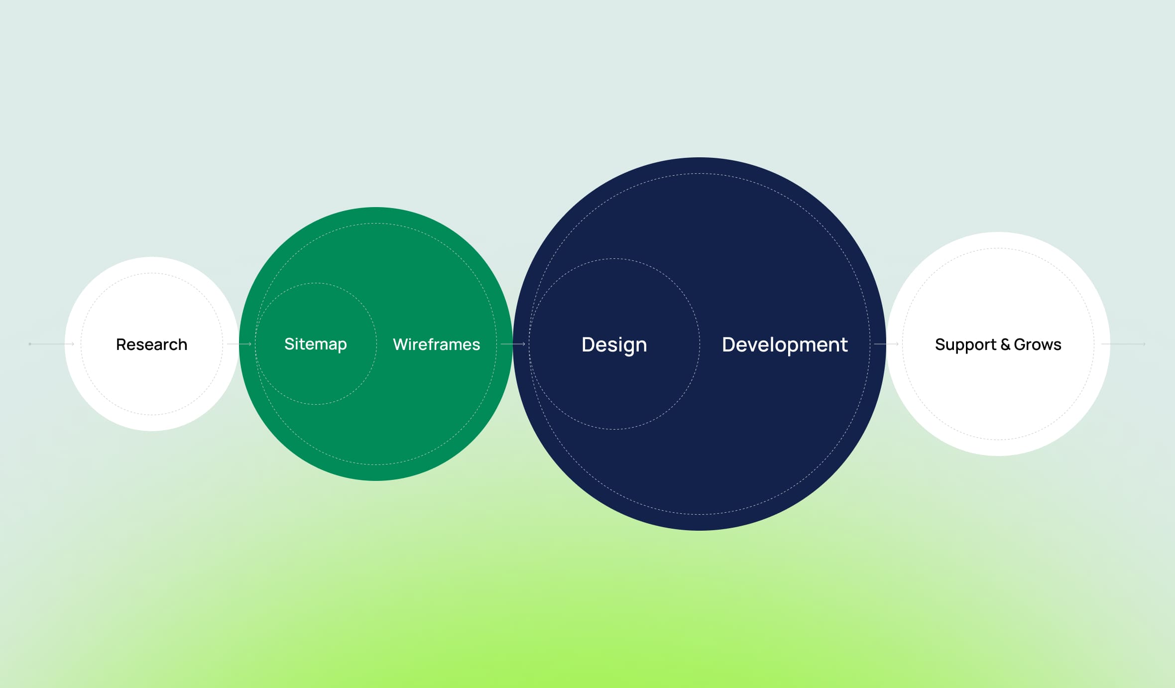
Ход работы и принятые решения
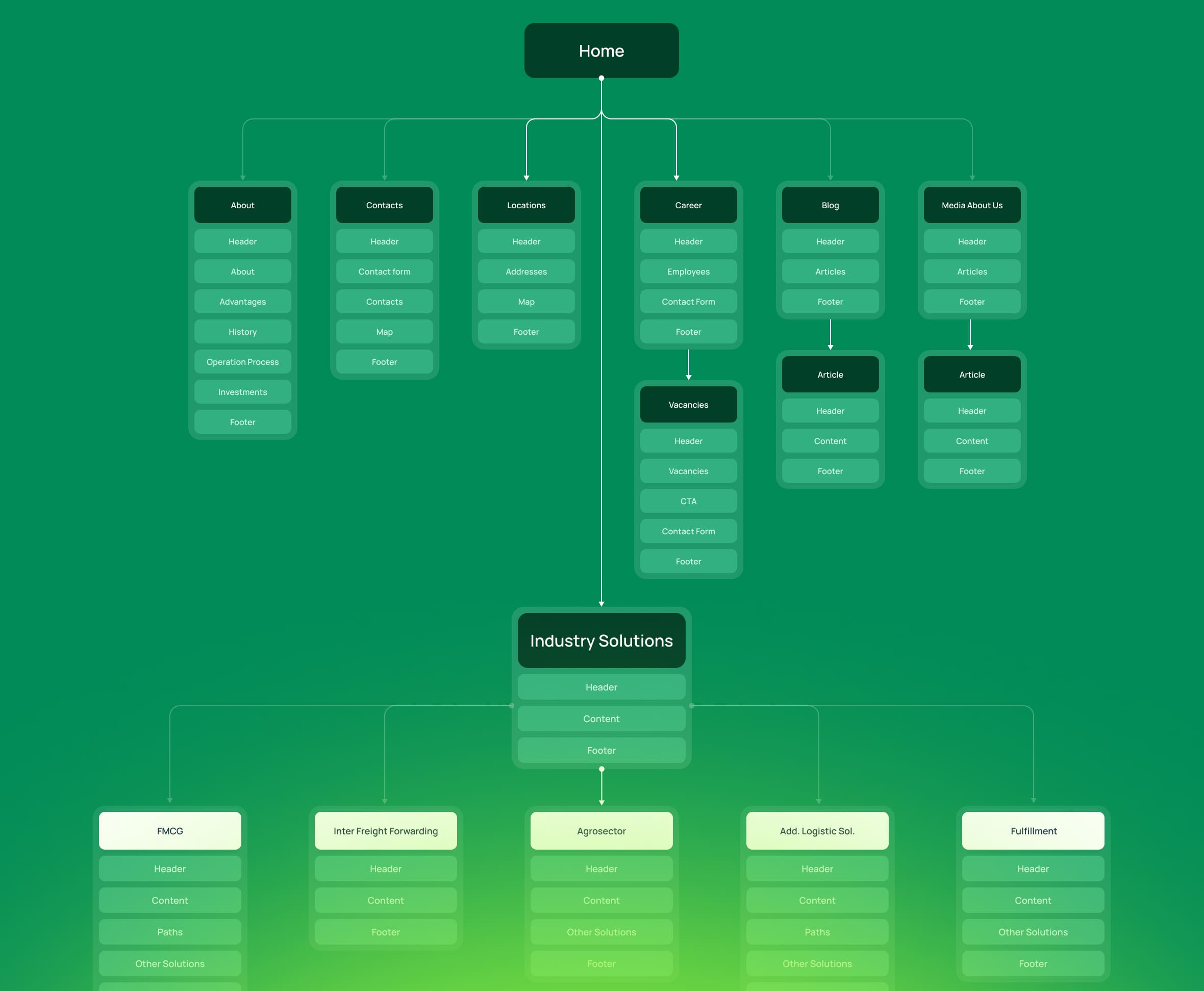
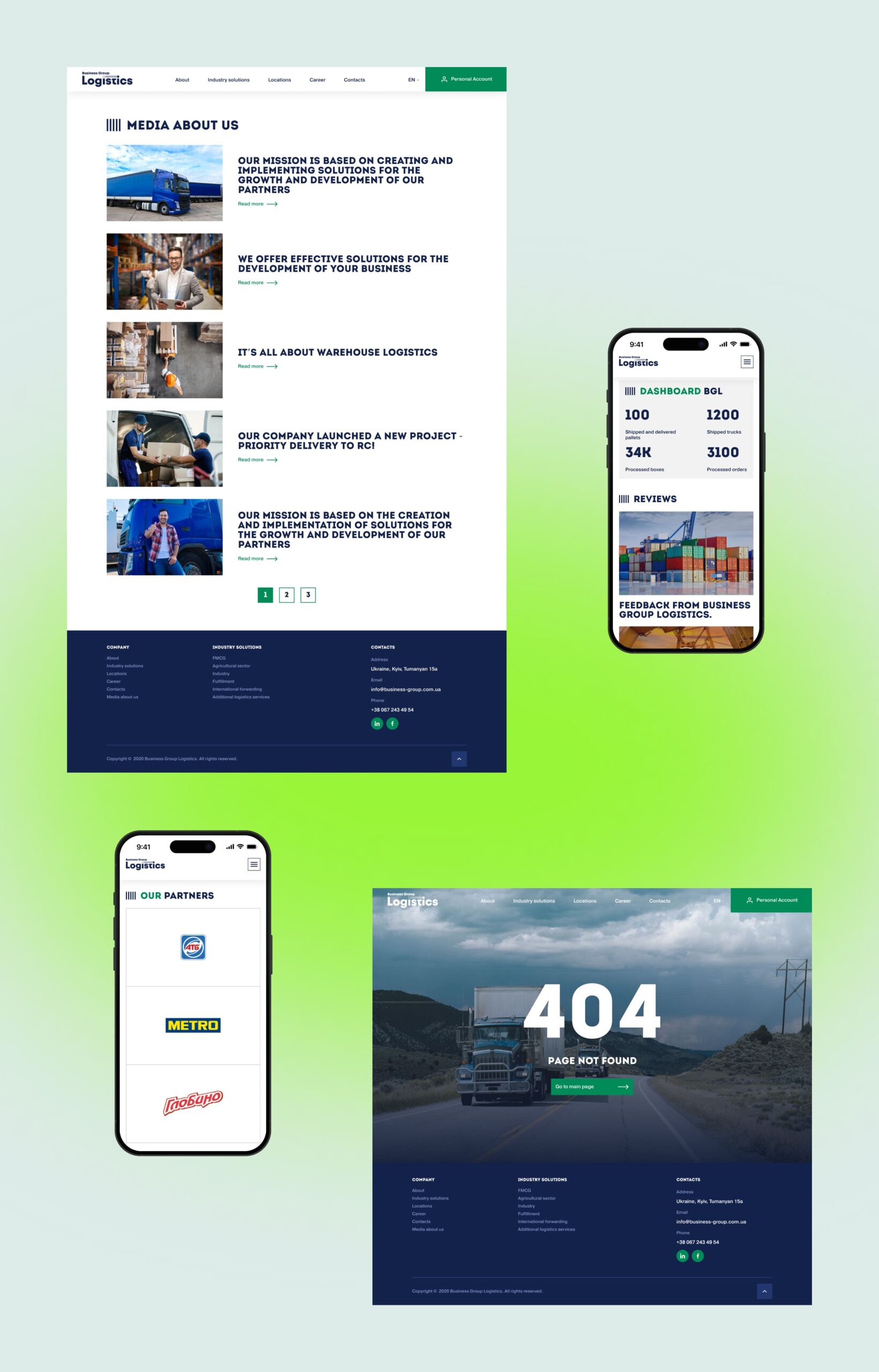
Аудит предыдущей версии сайта выявил три ключевые проблемы: перегруженность текстом, запутанную навигацию и отсутствие чётких призывов к действию (CTA). Эти факторы усложняли восприятие информации и препятствовали конверсии посетителей в клиентов.
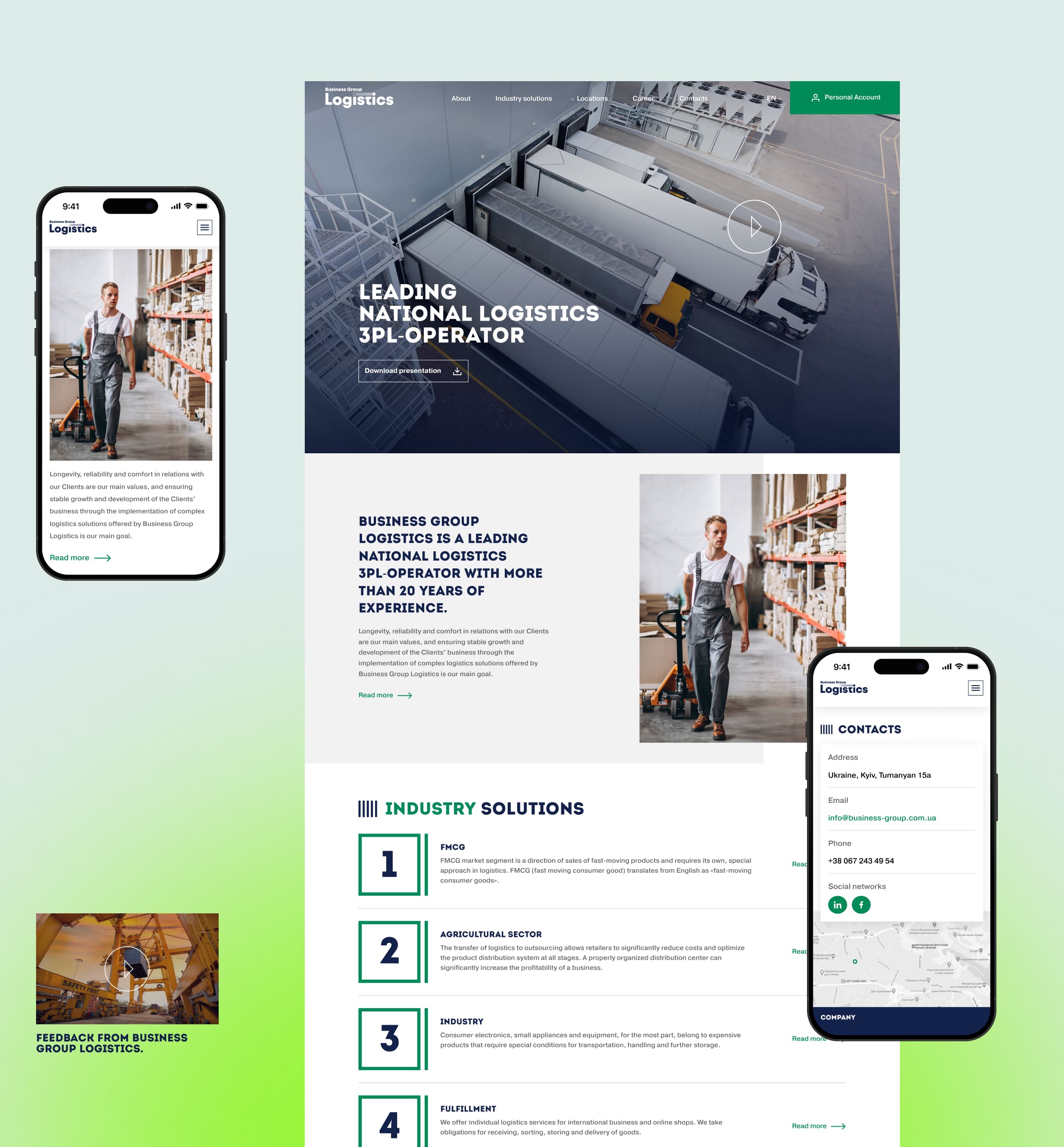
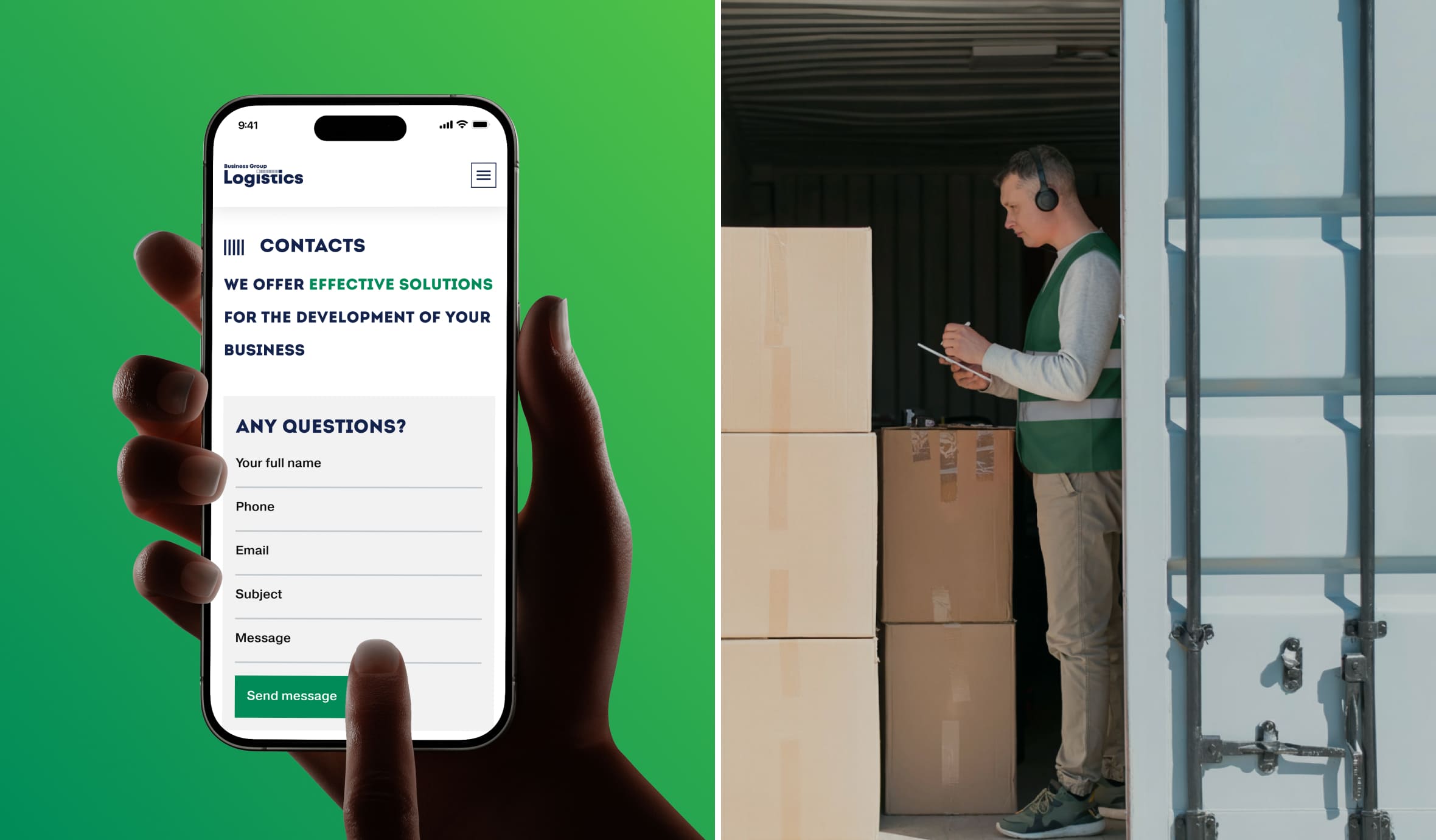
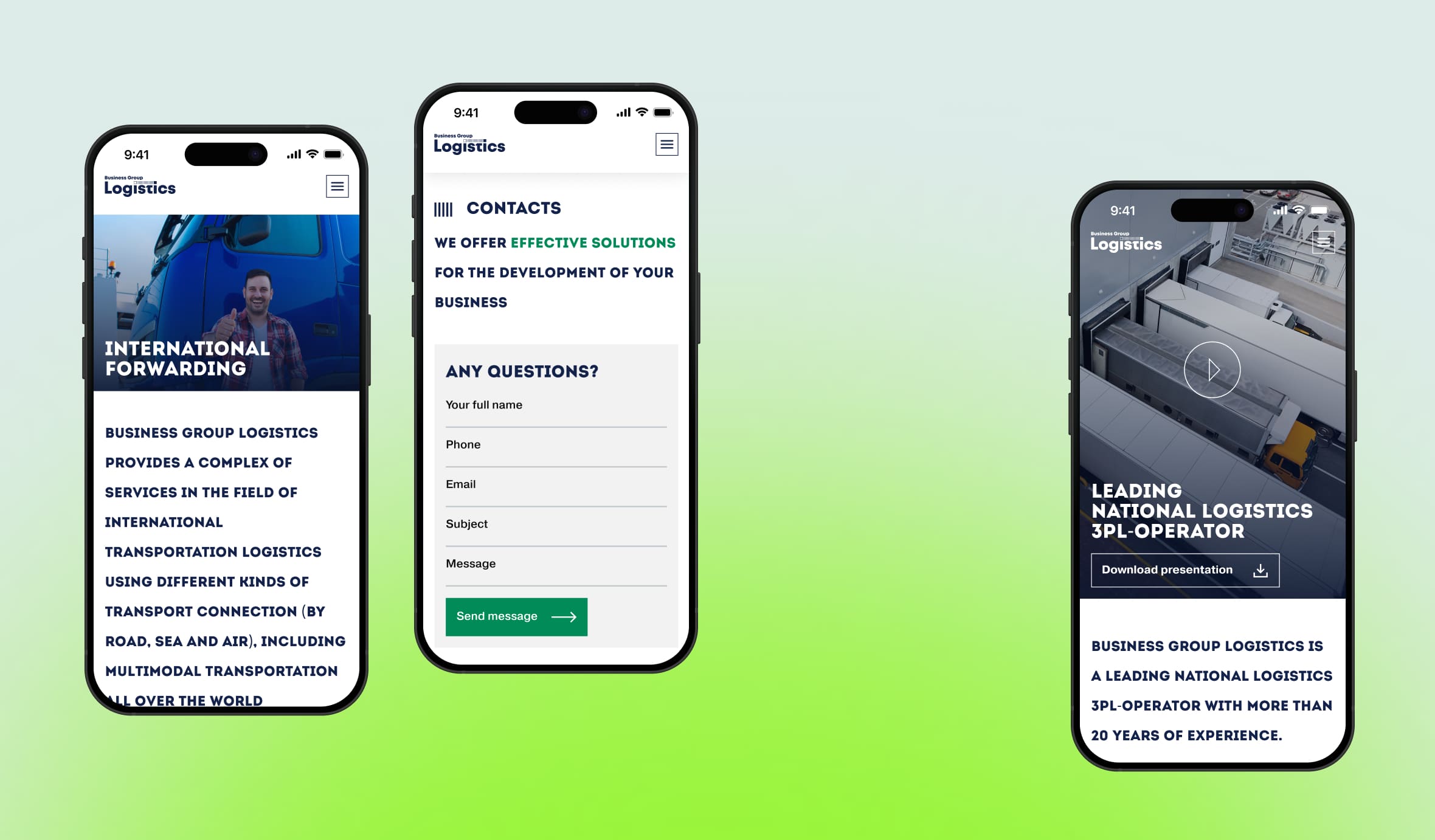
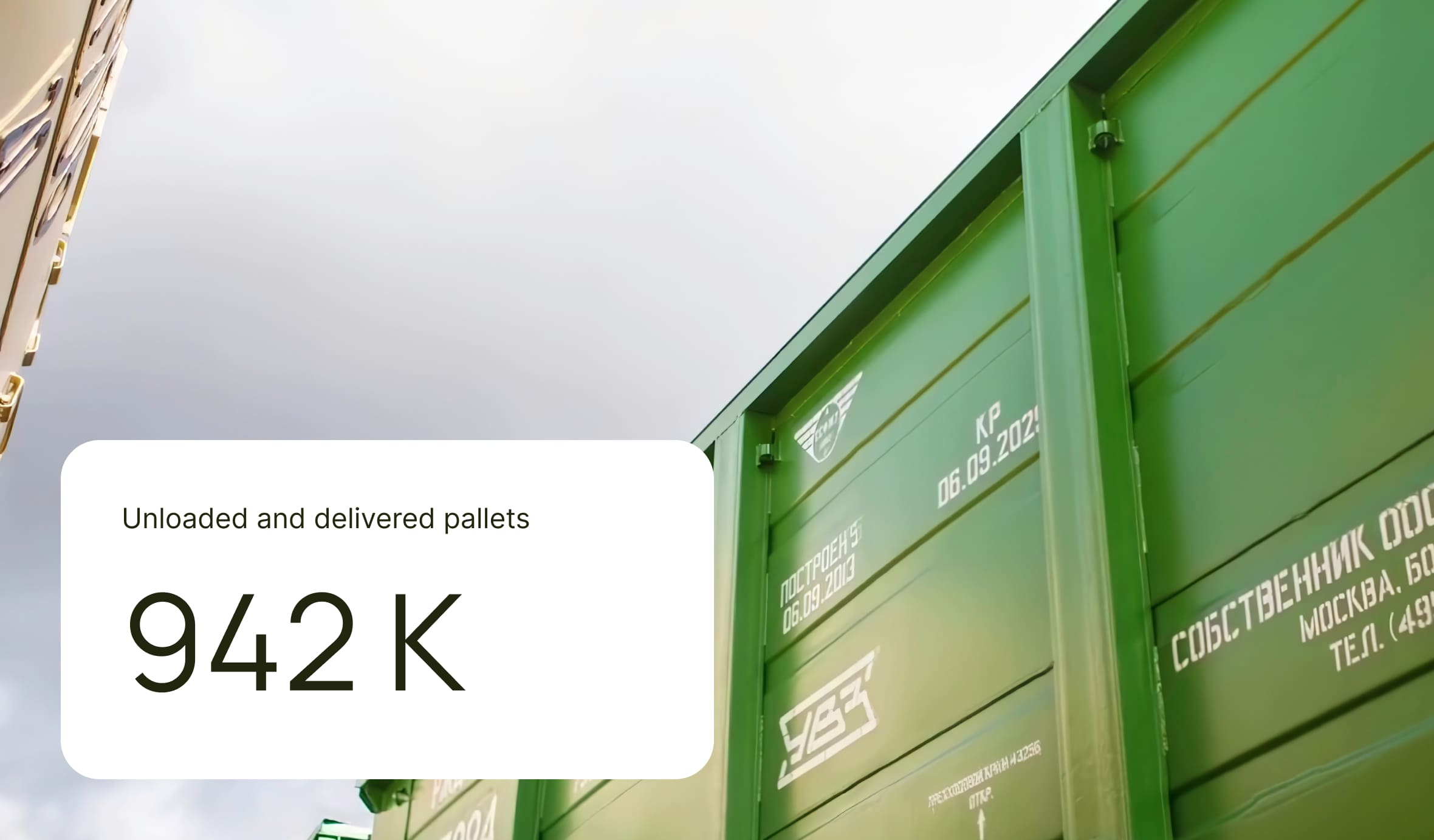
На основе результатов аудита мы разработали UX-стратегию, ориентированную на быстрый и интуитивный доступ к информации. Главная страница была преобразована в стратегический хаб, а разделы услуг получили систему интерактивных карточек для удобного изучения. Блок «О компании» был усилен реальными показателями для повышения доверия, а путь к связи максимально упрощён за счёт лаконичных форм и интерактивной карты.
Дизайн-концепция
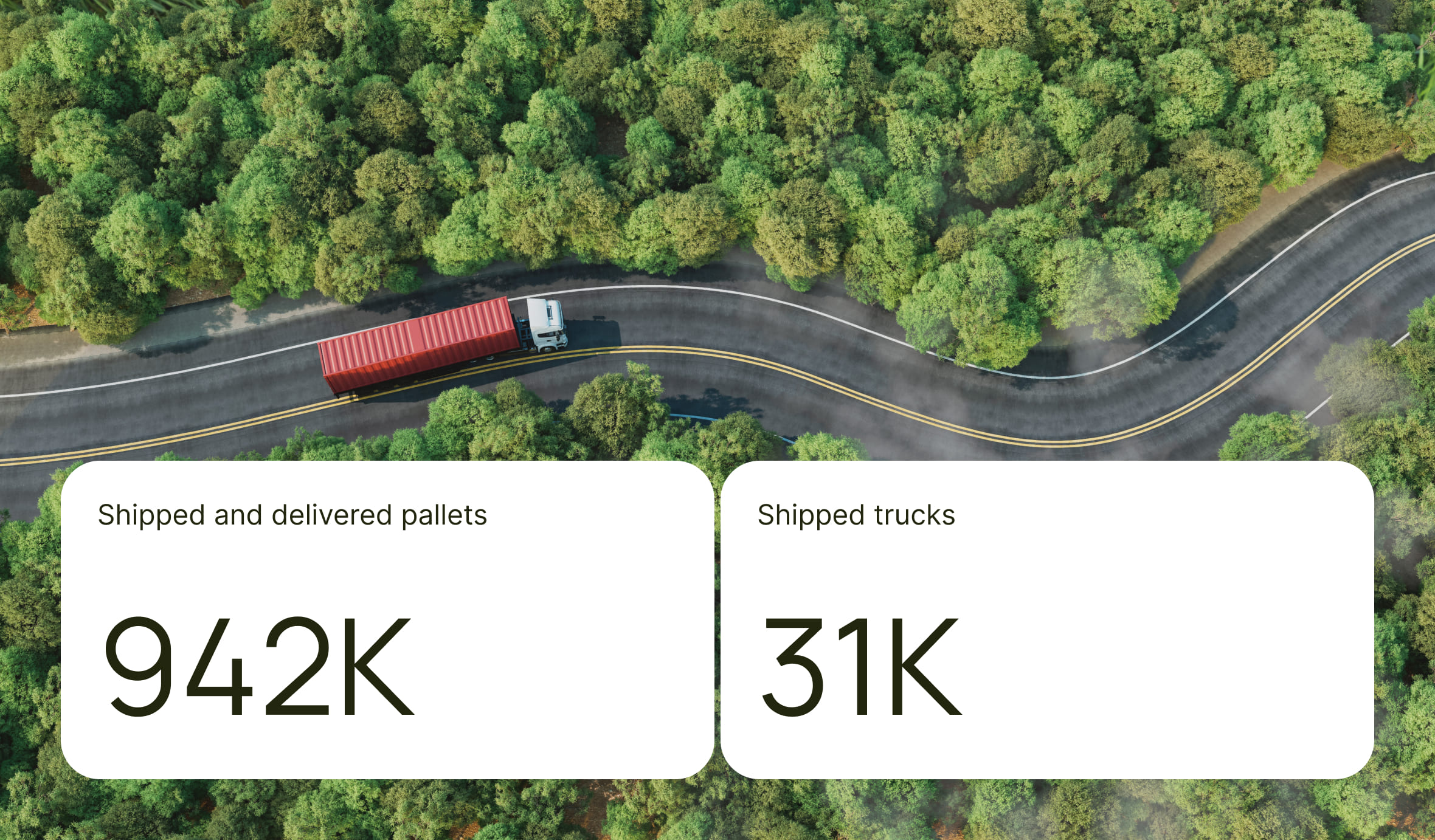
Концепция объединяет принципы ясности и доверия, реализованные через строгую сетку, лаконичные формы и выразительную типографику. Динамика интерфейса подчёркнута продуманными анимациями при скролле для метрик и карточек услуг, а интегрированный дашборд «BGL 2025» наглядно визуализирует актуальные показатели, делая платформу максимально информативной и современной.
UI Kit и визуальный язык
Мы интегрировали дизайн сайта в общую систему визуальной идентификации бренда, взяв за основу наработки партнёров — от презентационных материалов до схем складской логистики. Это позволило не только сохранить узнаваемость бренда, но и усилить её в цифровой среде за счёт фирменной типографики и стратегической цветовой палитры: глубокий синий транслирует надёжность 3PL-оператора, яркий зелёный акцентирует постоянное развитие, а нейтральный серый подчёркивает технологичность процессов.
Функциональные решения
Особое внимание было уделено функциональности и удобству взаимодействия. Мы интегрировали формы быстрого запроса в каждый раздел услуг для повышения конверсии, а также разработали интерактивную карту маршрутов, наглядно демонстрирующую масштаб международного покрытия компании. Благодаря принципу полной адаптивности, сайт обеспечивает безупречный пользовательский опыт на всех устройствах — от настольных компьютеров до смартфонов — гарантируя стабильную работу и корректное отображение контента в любых условиях.
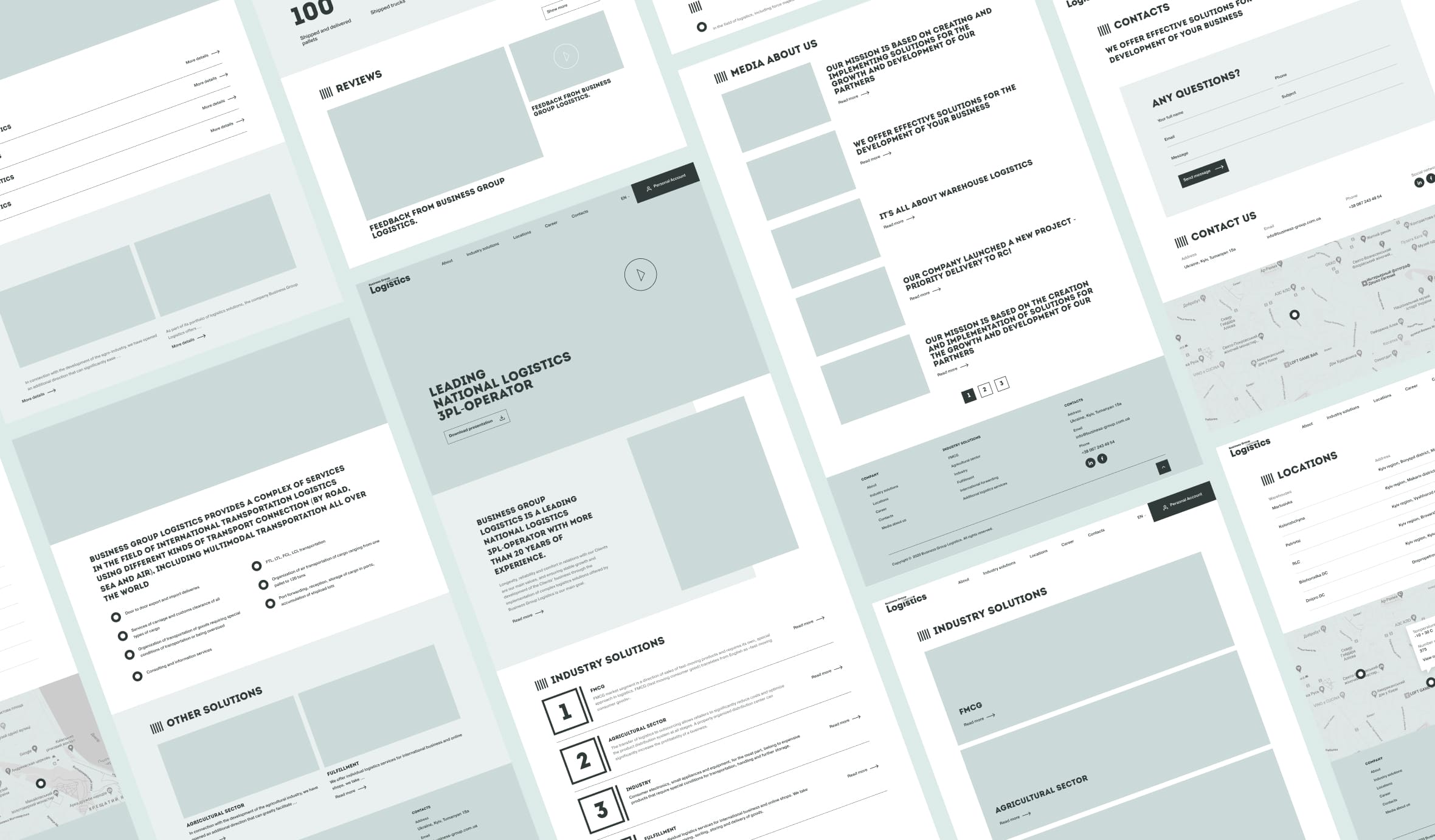
Визуальный стиль и эстетика
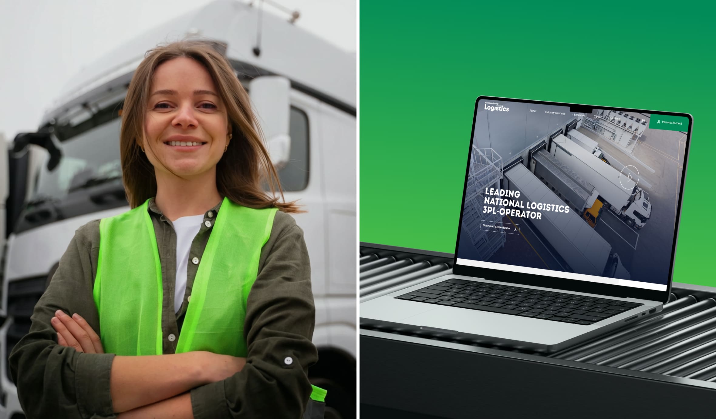
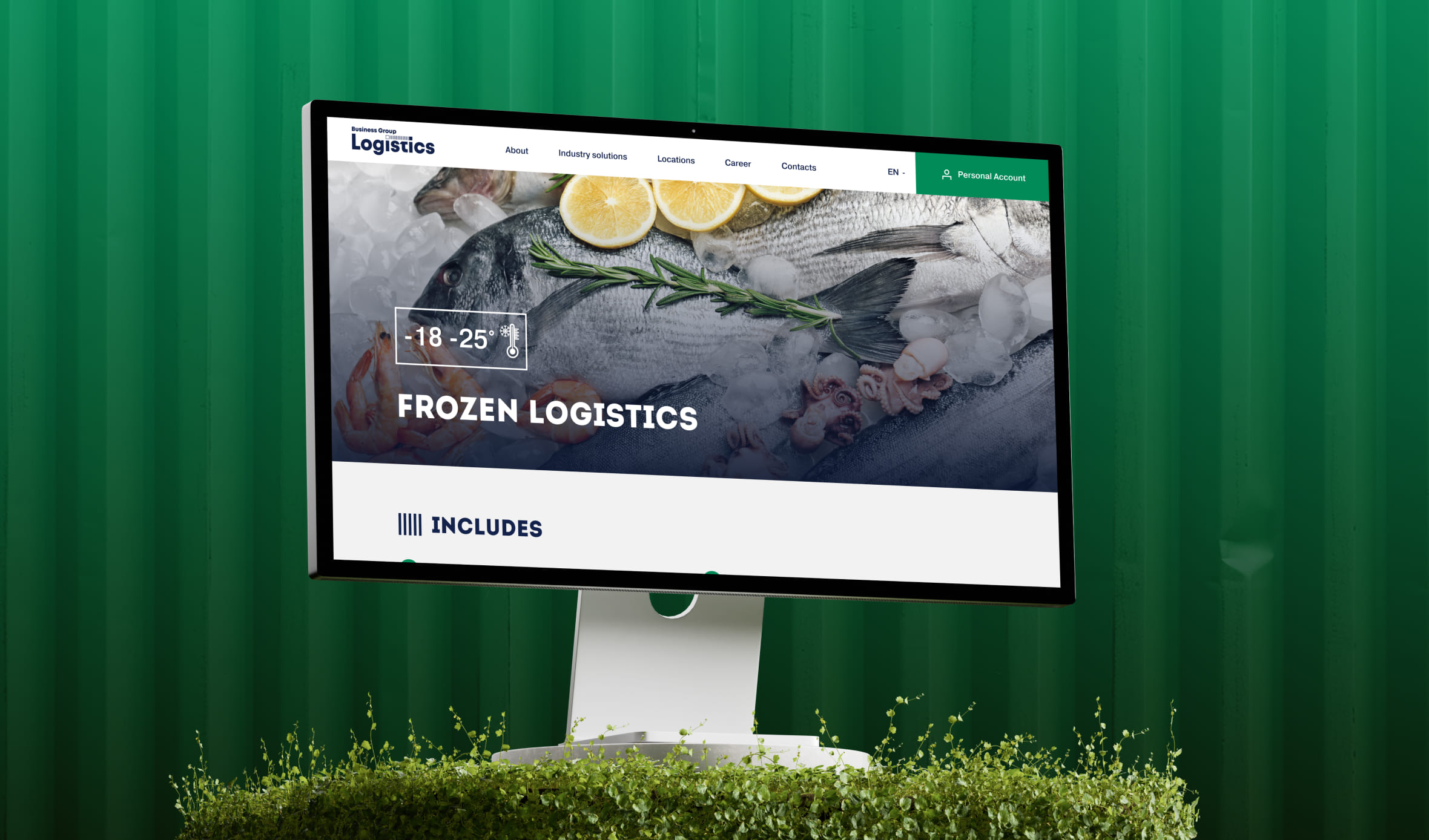
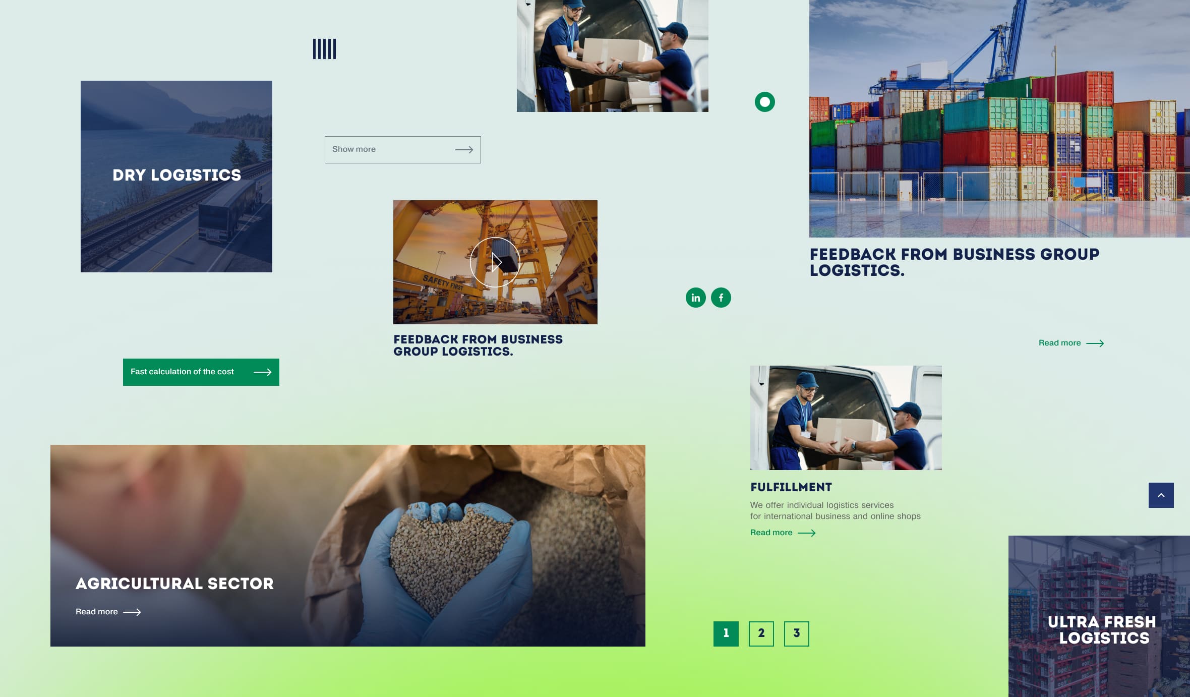
Новая визуальная концепция основана на принципах чистоты и функциональности. Мы отказались от перегруженных фонов в пользу лаконичных акцентных блоков, которые фокусируют внимание на содержании. Эстетику бренда подчёркивают аутентичные фотографии складов и транспорта в фирменной обработке. В сочетании с наглядной инфографикой логистических циклов они делают сложные процессы простыми для восприятия. Завершённость интерфейсу придаёт продуманная микродинамика — плавные переходы, анимированные счётчики и интерактивные эффекты, которые делают взаимодействие с сайтом живым и современным.


Результаты проекта
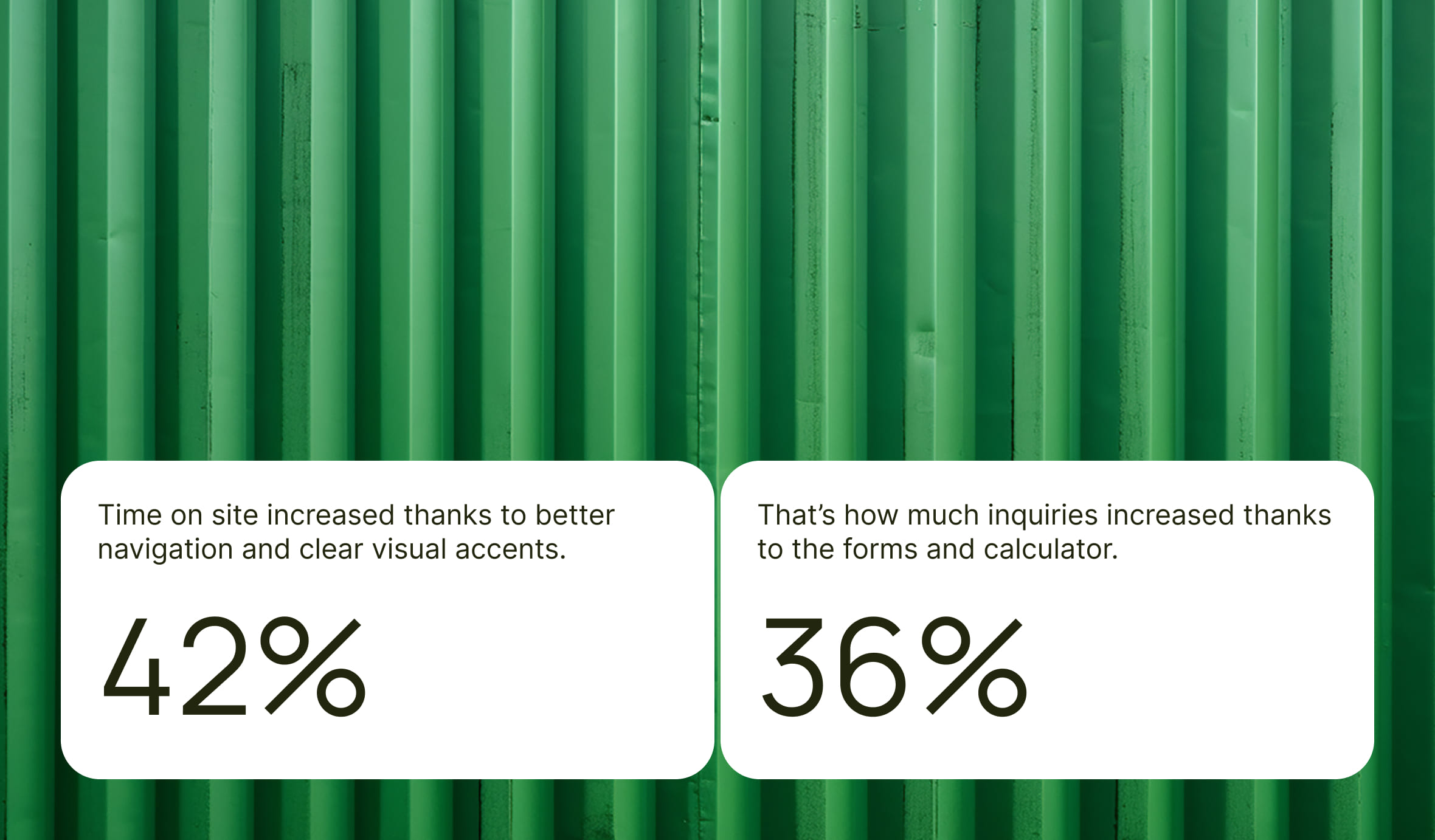
Запуск новой версии сайта стал мощным импульсом для развития бренда. Благодаря интуитивной навигации и чётким визуальным акцентам среднее время пребывания пользователей на сайте увеличилось на 42%. Обновлённая платформа не только укрепила позиционирование компании как современного и технологичного лидера, который транслирует свои ценности через каждую деталь интерфейса, но и превратилась в эффективный маркетинговый инструмент. Полная интеграция с CRM-системой, а также запуск разделов блога и кейсов открыли новые возможности для привлечения клиентов и масштабирования бизнеса в цифровой среде.
Вывод
Редизайн Business Group Logistics стал не просто обновлением внешнего вида, а полноценным инструментом продаж и коммуникации, отражающим лидерство компании в отрасли. Современный UX/UI помог подчеркнуть конкурентные преимущества и сделать взаимодействие с клиентами простым, понятным и эффективным.
Что о нас говорят наши партнеры
Скорее всего, вы будете на 100% довольны работой результат 5.0 - это наш средний показатель.

8 Отзывов
5.0
Скорее всего, вы будете на 100% довольны работой результат 5.0 - это наш средний показатель.